

CSS GRID
Grid Layout
The CSS Grid Layout Module offers a grid-based layout system, with rows and columns, making it easier to design web pages without having to use floats and positioning.
Grid Elements
A grid layout consists of a parent element, with one or more child elements.
Code Sample:
<div class="grid-container">
  <div class="grid-item">1</div>
  <div class="grid-item">2</div>
  <div class="grid-item">3</div>
  <div class="grid-item">4</div>
  <div class="grid-item">5</div>
  <div class="grid-item">6</div>
  <div class="grid-item">7</div>
  <div class="grid-item">8</div>
  <div class="grid-item">9</div>
</div>
Display Property
- grid
- inline-grid
Code Sample:
.grid-container {
  display: grid;
}
.grid-container {
  display: inline-grid;
}
The grid property is a shorthand property for:
- grid-template-rows
- grid-template-columns
- grid-template-areas
- grid-auto-rows
- grid-auto-columns
- grid-auto-flow
CSS Syntax
grid: none|grid-template-rows / grid-template-columns|grid-template-areas|grid-template-rows / [grid-auto-flow] grid-auto-columns|[grid-auto-flow] grid-auto-rows / grid-template-columns|initial|inherit;
Grid Container
Grid containers consist of grid items, placed inside columns and rows.
- justify-content
- align-content
justify-content property
The justify-content property is used to align the whole grid inside the container.
- space-evenly
- space-around
- space-between
- center
- start
- end
Code Sample:
grid-container {
  display: grid;
  justify-content: center;
}
align-content Property
The align-content property is used to vertically align the whole grid inside the container.
- center
- space-evenly
- space-around
- space-between
- start
- end
Code Sample
.grid-container {
  display: grid;
  height: 400px;
  align-content: space-evenly;
}
Grid Template
The grid-template property is a shorthand property for the following properties:
- grid-template-rows
- grid-template-columns
- grid-template-areas
CSS Syntax
grid-template: none|grid-template-rows / grid-template-columns|grid-template-areas|initial|inherit;
Grid Template Rows
The grid-template-rows property specifies the number (and the heights) of the rows in a grid layout.
CSS Syntax
grid-template-rows: none|auto|max-content|min-content|length|initial|inherit;
Code Sample:
.grid-container {
  display: grid;
  grid-template-rows: 100px 300px;
}
Grid Template Columns
The grid-template-columns property specifies the number (and the widths) of columns in a grid layout.
CSS Syntax
grid-template-columns: none|auto|max-content|min-content|length|initial|inherit;
Code Sample:
.grid-container {
  display: grid;
  grid-template-columns: auto auto auto auto;
}
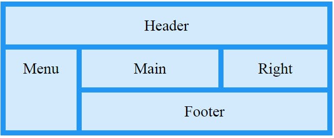
Grid Template Areas
The grid-template-areas property specifies areas within the grid layout.
CSS Syntax
grid-template-areas: none|itemnames;
Code Sample:
.item1 { grid-area: header; }
.item2 { grid-area: menu; }
.item3 { grid-area: main; }
.item4 { grid-area: right; }
.item5 { grid-area: footer; }

.grid-container {
  display: grid;
  grid-template-areas:
    'header header header header header header'
    'menu main main main right right'
    'menu footer footer footer footer footer';
}
Grid Area
The grid-area property specifies a grid item's size and location in a grid layout, and is a shorthand property for the following properties:
- grid-row-start
- grid-column-start
- grid-row-end
- grid-column-end
CSS Syntax
grid-area: grid-row-start / grid-column-start / grid-row-end / grid-column-end | itemname;
Code Sample:
.item1 {
  grid-area: 2 / 1 / span 2 / span 3;
}
Grid Columns
The vertical lines of grid items are called columns.
grid-column property
- grid-column-start
- grid-column-end
CSS Syntax
grid-column: grid-column-start / grid-column-end;
Code Sample:
.item1 {
  grid-column: 1 / span 3;
}
Code Sample:
.item1 {
  grid-column: 1 / 3;
}
Grid Rows
The horizontal lines of grid items are called rows.
grid-row property
- grid-row-start
- grid-row-end
CSS Syntax
grid-row: grid-row-start / grid-row-end;
Code Sample:
.item1 {
  grid-row: 1 / 3;
}
Grid Auto
- grid-auto-cloumns
- grid-auto-flow
- grid-auto-rows
Grid Auto Columns
The grid-auto-columns property sets a size for the columns in a grid container.
CSS Syntax
grid-auto-columns: auto|max-content|min-content|length;
Code Sample:
.grid-container {
  display: grid;
  grid-auto-columns: 50px;
}
Grid Auto Flow
The grid-auto-flow property controls how auto-placed items get inserted in the grid, by inserting items row-by-row or column-by-column.
CSS Syntax
grid-auto-flow: row|column|dense|row dense|column dense;
Code Sample:
.grid-container {
  display: grid;
  grid-auto-flow: column;
}
Grid Auto Rows
The grid-auto-rows property sets a size for the rows in a grid container.
CSS Syntax
grid-auto-rows: auto|max-content|min-content|length;
Code Sample:
.grid-container {
  display: grid;
  grid-auto-rows: 150px;
}
Grid Gaps
The spaces between each column/row are called gaps.
Grid Gaps Properties
- grid-gap
- grid-column-gap
- grid-row-gap
CSS Syntax
grid-gap: grid-row-gap grid-column-gap;
Code Sample:
.grid-container {
  grid-gap: 20px 50px;
}
Grid Column Gap
- grid-column-gap properties
Code Sample:
.grid-container {
  display: grid;
  grid-column-gap: 50px;
}
Grid Row Gap
- grid-row-gap properties
Code Sample:
.grid-container {
  display: grid;
  grid-column-gap: 50px;
}
Grid Lines
The lines between columns are called column lines. The lines between rows are called row lines.